Creating a harmonious interior is not just about buying an expensive sofa or a stylish wardrobe, but a delicate work with space, where the interaction of vertical surfaces and furnishings plays a key role. Properly selected furniture can “dissolve” in space, visually expanding the room, or, conversely, become a bright accent that sets the dynamics for the entire room. Planning errors often lead to even the highest quality furniture looking out of place or making the room uncomfortable. In this guide, we will analyze the technical and aesthetic aspects of how to choose furniture to match wall colors, based on color theory, material science, and ergonomics.
Harmony in the Interior: How to Choose Furniture to Match Wall Colors
The basis of any professional design is the “60-30-10” rule. According to this formula, 60% of the space is occupied by the main color (usually walls and floor), 30% by the secondary color (large furniture, textiles), and 10% by color accents (decor, hardware). When you start choosing furniture, you are working with these 30%, which should either support the dominant background or create a competent contrast with it.
The first thing to pay attention to is the Light Reflectance Value (LRV) of your walls. If the walls are painted in dark tones with a low LRV (less than 20%), the furniture should either have high reflectivity (glossy facades, metal) or be 2-3 shades lighter to avoid turning the room into a “black hole.” On light walls (LRV above 70%), furniture of any saturation looks great, but here it is important to maintain a balance of warmth and coolness.
Practical tip: before ordering furniture, take a paint or wallpaper sample and place it against the facade (particleboard, MDF) or upholstery fabric samples in the store. Lighting in furniture showrooms often has a color temperature of 4000K-5000K (cool white), while at home, lamps of 2700K-3000K (warm yellow) are more commonly used. This can drastically change the perception of color: a gray sofa can “turn” into a dirty beige, and blue kitchen facades into purple.
Color Schemes: 5 Proven Combinations of Furniture and Walls
To avoid mistakes in choosing, experts recommend using the Itten color wheel. There are five basic schemes that guarantee results:
- Monochromatic Scheme. You choose furniture in the same color palette as the walls, but vary the saturation. For example, a graphite sofa is placed against light gray walls. This creates a calm, “enveloping” interior. To prevent the furniture from blending with the walls, use different textures: matte walls and velvet upholstery.
- Analogous Scheme. Colors that are next to each other on the color wheel are used. For green walls, choose furniture in shades of blue or yellow (e.g., an ochre armchair). This looks natural and harmonious, reminiscent of natural combinations.
- Complementary (Contrast) Scheme. Furniture is chosen in a color opposite to the wall color. Blue walls – orange or terracotta furniture. This is a bold decision that requires care. It is important that one color is dominant (walls), and the second is an accent (armchair or chest of drawers).
- Neutral Background + Bright Furniture. The most popular option. White, beige, or light gray walls serve as a canvas for richly colored furniture: emerald, burgundy, deep blue. This allows you to easily change the mood of the room by simply reupholstering furniture or changing facades.
- Bright Walls + Neutral Furniture. If you decide on an accent wall in fuchsia or deep anthracite, the furniture should be as calm as possible – white, light wood, or gray. This balances the space and relieves visual tension.
When choosing contrasting combinations, remember about saturation. Bright walls require muted furniture tones, and vice versa. If both the walls and the furniture are maximally saturated, staying in such a room for a long time will be tiring for the psyche.
Materials and Shades: The Influence of Texture on Furniture Color Perception
Furniture color is not just pigment, but also material texture. The same “Sonoma oak” shade will look different depending on whether it is applied to smooth particleboard or to a veneered panel with deep embossing. Texture changes the way light is reflected, which is critically important when matching wall colors.
Wood and Wood-based Panels. Natural wood has its own undertone (yellow, pink, gray). If you have cool blue walls, pine or birch furniture (with a yellow undertone) will create an active contrast. For a calmer combination, it is better to choose oak with gray undertones or wenge. Important: try not to mix more than two different wood textures in one visible area.
Glossy vs. Matte Surfaces. Glossy facades (MDF in enamel or acrylic) act like mirrors. They partially take on the color of the walls. If the walls are bright green, a white glossy kitchen will have a slight greenish tint. Matte surfaces, on the other hand, absorb light and convey color as honestly as possible. In small rooms with dark walls, glossy furniture is a lifesaver, as it adds depth.
Textiles. Pile fabrics (velvet, velour, chenille) change shade depending on the direction of the pile and the angle of light. Smooth fabrics (matting, linen) give a more stable color. When choosing upholstered furniture for patterned wallpaper, the rule is: if the wallpaper has an active print, the furniture should be plain. If the walls are smooth, you can afford a textured fabric or even a pattern on the upholstery.
Choosing Furniture to Match Wall Colors: Practical Tips for Different Rooms
Each room has its own functional features that dictate the rules for selecting color pairs.
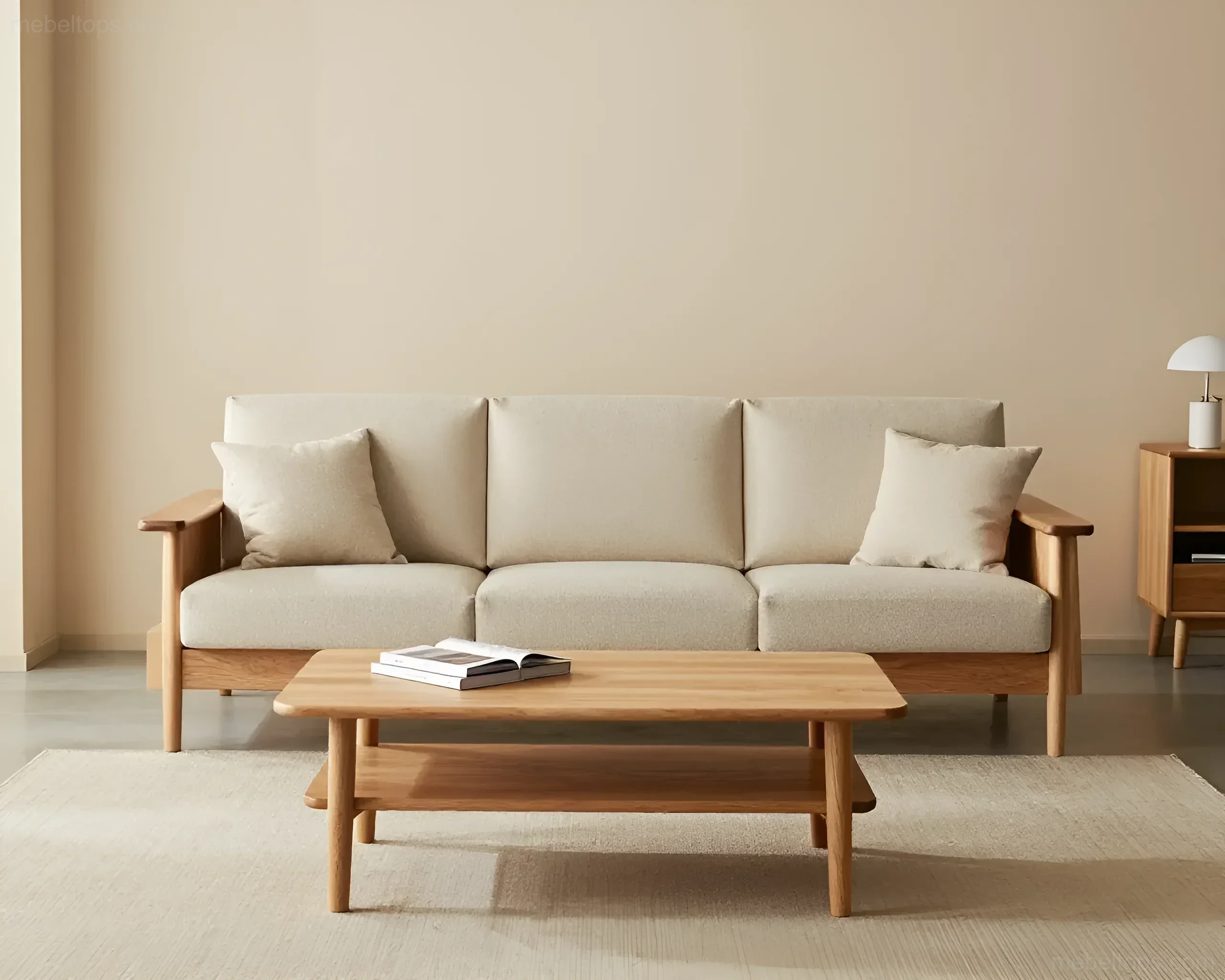
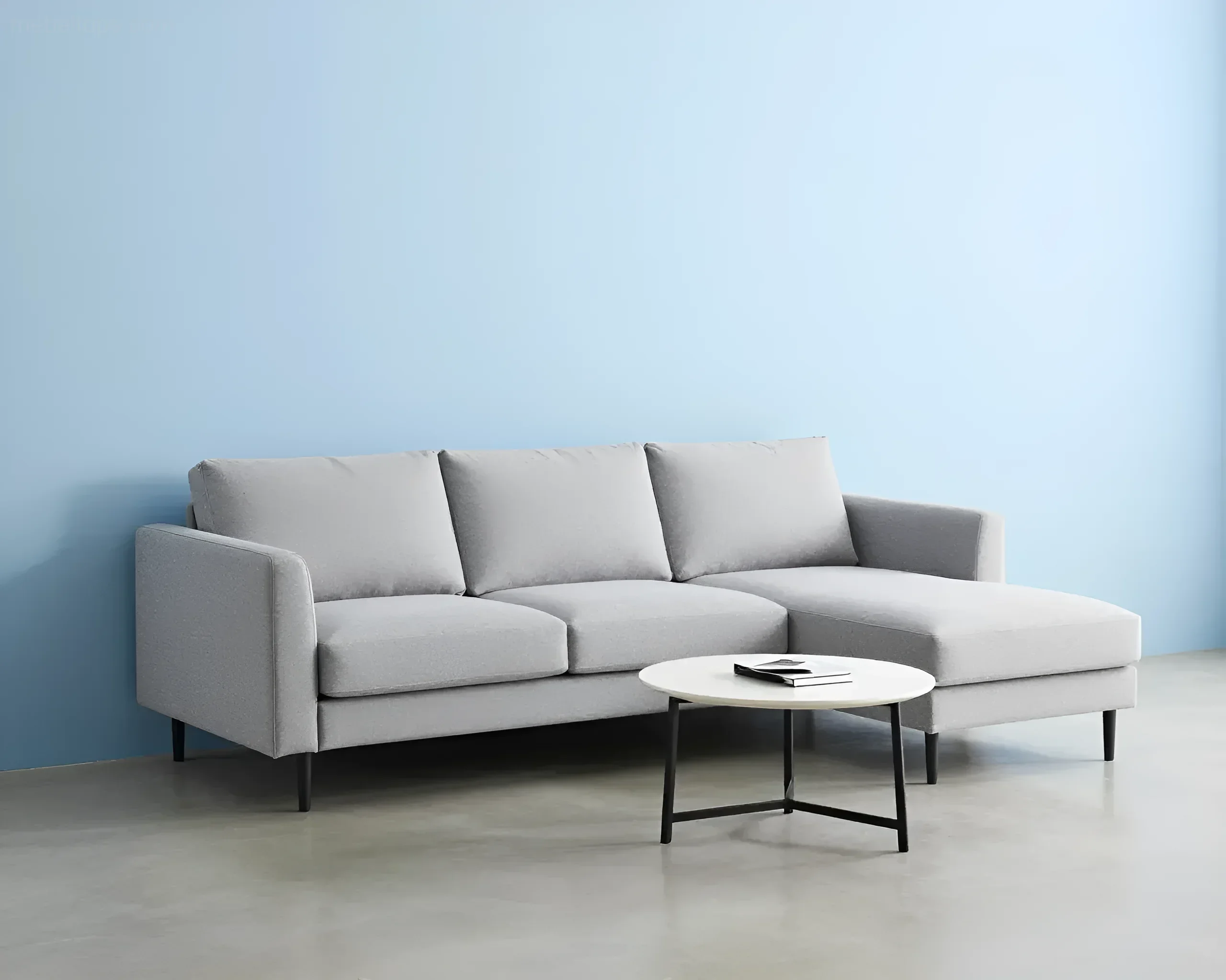
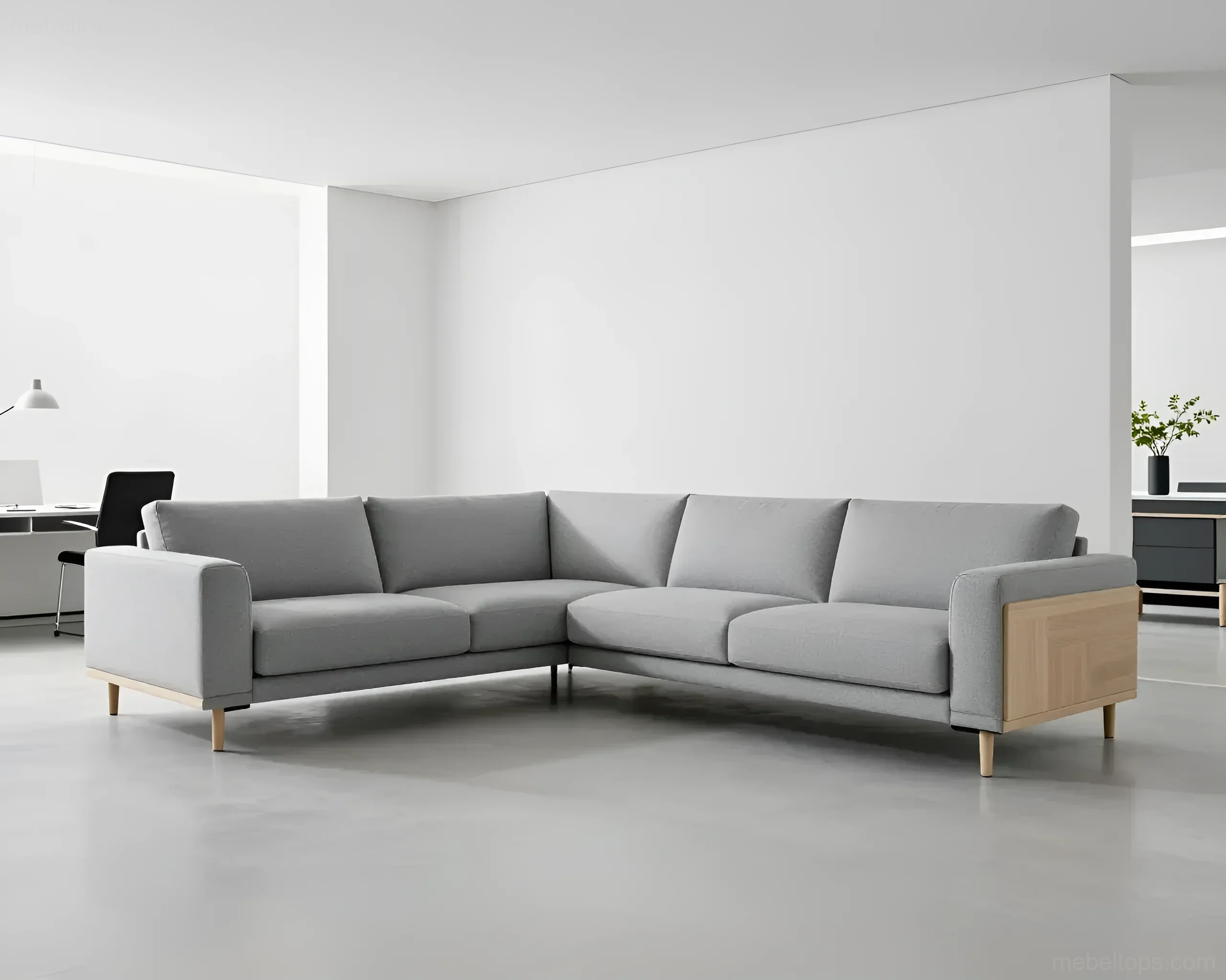
Living Room. The sofa is the centerpiece here. If the walls are light, choose a sofa 3-4 shades darker. If the walls are dark, furniture on legs (this adds airiness) in light tones will look good. Case goods (wall units, TV stands) should either match the wall color (to “disappear”) or contrast in material – for example, concrete walls and a warm walnut cabinet.
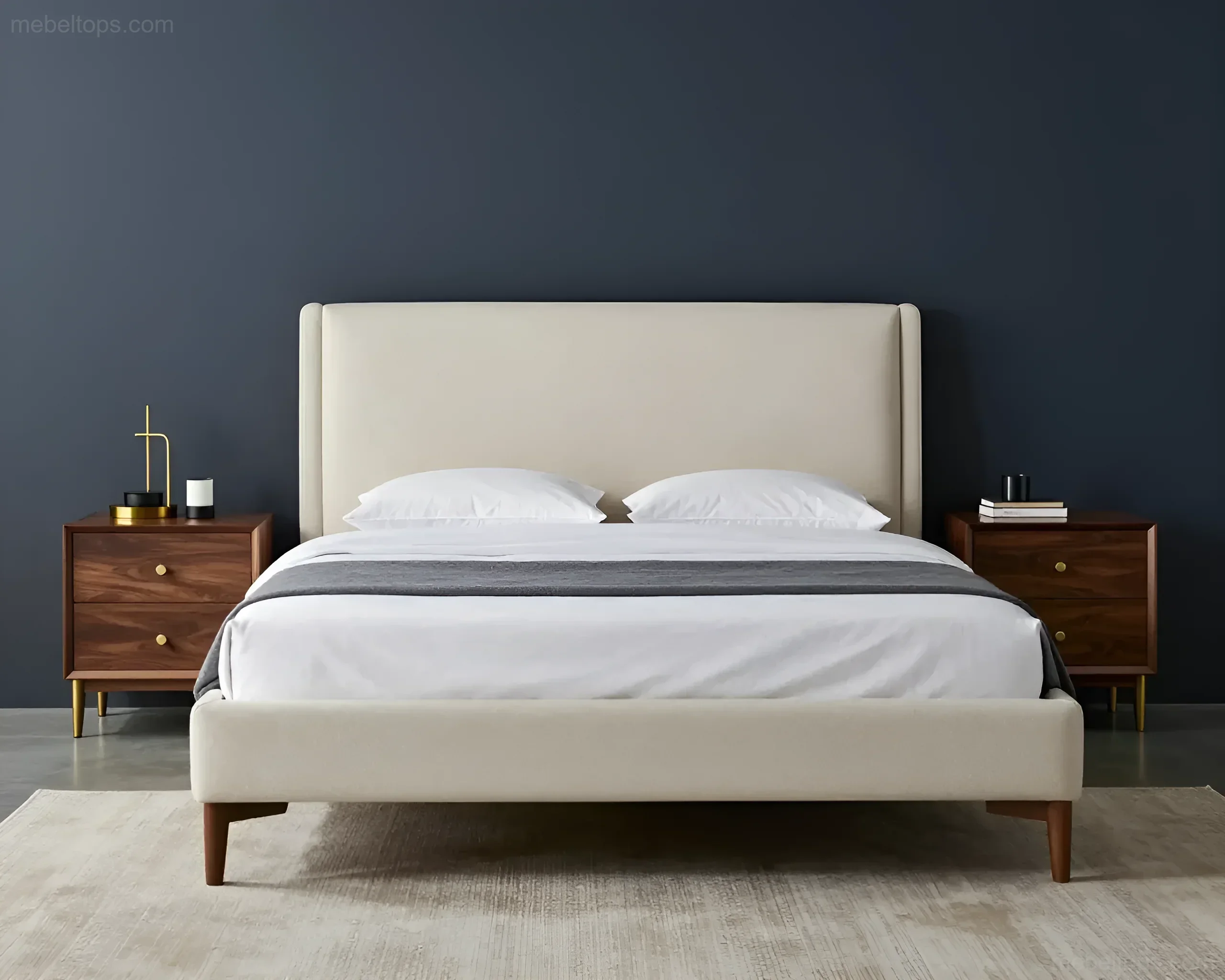
Bedroom. A place for rest requires minimal contrasts. The ideal solution is nuanced harmony. Walls in “dusty rose” and a headboard in gray or beige. Avoid black furniture against white bedroom walls – such a sharp contrast hinders relaxation. It is better to use soft transitions: cream, pearl, coffee.
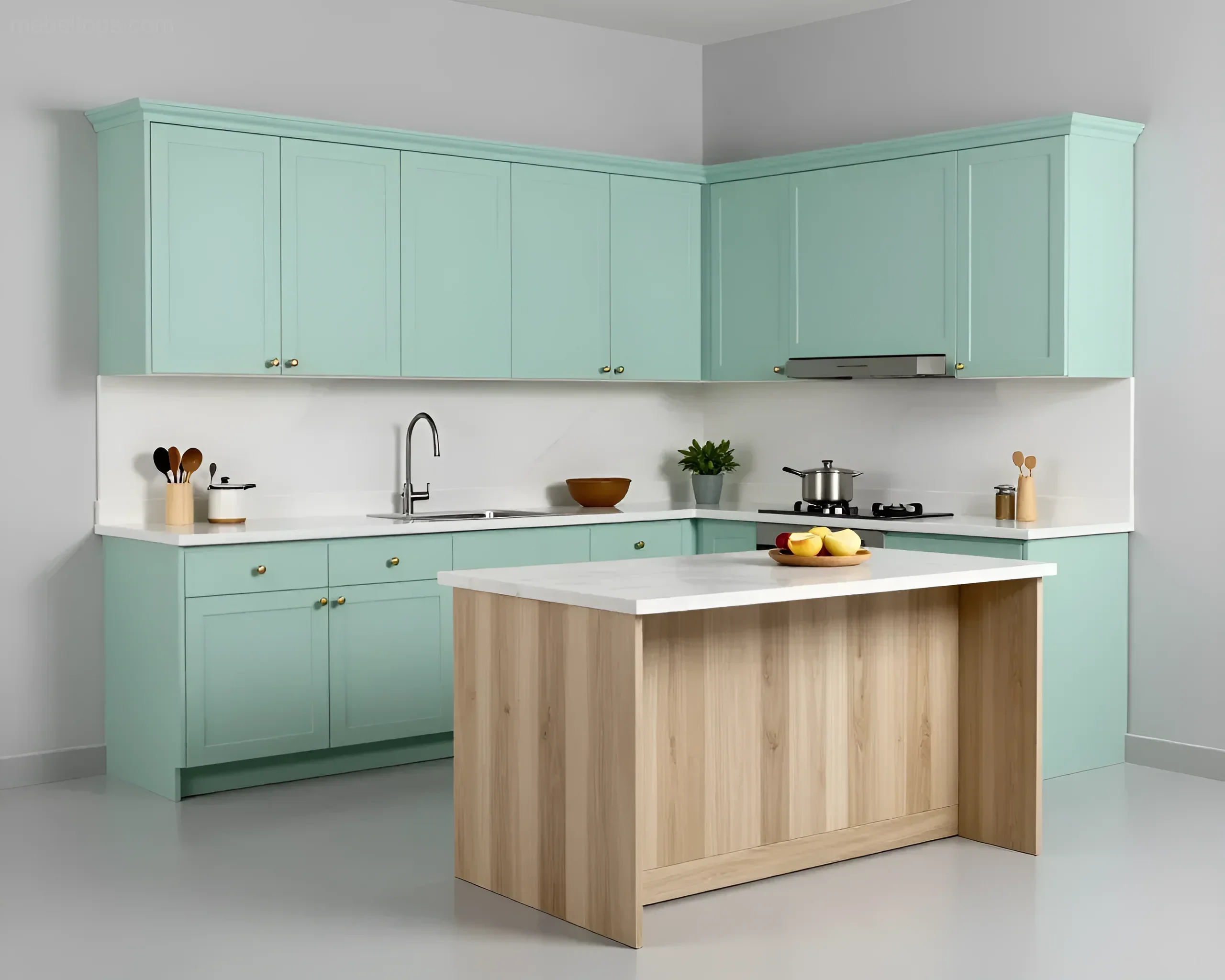
Kitchen. Here we work with facades and backsplashes. If the walls are bright, the kitchen set should be neutral (white, light gray, wood). If you want a bright kitchen, the walls should be as neutral as possible. Important nuance: the color of the lower cabinets can be darker than the walls, and the upper ones – the same color as the walls, this will visually raise the ceiling.
Hallway. This is usually a narrow space without windows. To prevent furniture from “cluttering” the passage, choose it to match the wall color exactly. A white wardrobe against white walls becomes practically invisible, while retaining all storage functionality.
Dimensions and Proportions: How Furniture Interacts with Wall Color Solutions
Color has the ability to change the visual weight and dimensions of objects. This must be taken into account when planning furniture placement. Dark objects always look heavier and more massive than light ones, even if their physical dimensions are identical.
If you place a massive sliding wardrobe (2400 mm high and 1800 mm wide) in a dark “wenge” color against a light wall, it will dominate the room, visually “eating up” space. To level this effect, you can choose a model with mirror inserts or facades painted in the wall color. In this case, the wardrobe will be perceived as part of the architecture, not as a separate bulky object.
Conversely, small, elegant items (coffee tables, consoles) in a dark color against a light background look like graphic accents that emphasize the room’s geometry. If you have a spacious living room with high ceilings and dark walls, large light-colored furniture will help structure the space without making it too gloomy.
Technical Table: Visual Perception of Furniture Depending on Wall Color
| Wall Color | Furniture Color | Visual Effect |
|---|---|---|
| Light (white, beige) | Dark | Furniture appears smaller but clearly defined. High contrast. |
| Light (white, beige) | Light, matching tone | Furniture blends with the walls, space expands. |
| Dark (blue, graphite) | Light | Furniture “steps forward,” becoming the main accent. |
| Bright (yellow, terracotta) | Achromatic (gray) | Gray calms the bright background, the interior looks balanced. |
Style and Color: The Perfect Furniture for Your Walls
Each interior style has its own canonical color combinations that have been tested by time and professional designers. By focusing on the style, you automatically solve the problem of color matching.
- Scandinavian Style. Walls – white or light gray. Furniture – light wood (ash, birch), white lacquer, gray textiles. Accents can be black (table legs, hardware), which creates the necessary graphic quality.
- Loft. Walls – red brick, concrete, or rough plaster. Furniture – leather (brown, black), dark metal, solid wood with pronounced texture. Here, the furniture color should support the “industrial” feel of the background.
- Classic and Neoclassical. Walls – pastel tones, olive, sand. Furniture – white with gilding or dark wood (mahogany, cherry). Symmetry and nobility of shades are important.
- Minimalism. Monochromatic combinations are often used. Walls and furniture can be the same color, but of different materials (e.g., matte paint on the walls and glossy glass on the cabinet facades).
- Provence. Walls – lavender, light blue, pistachio. Furniture – must be light, often with an aged effect (patina), milky or cream colored.
When choosing a style, remember that the furniture should match the “temperature” of the style. For example, modern high-tech requires cool shades of metal and glass, which do not combine well with the warm “peach” walls of interiors from the 2000s.
TOP 5 Mistakes When Choosing Furniture to Match Wall Colors and How to Avoid Them
Even with good taste, you can make technical mistakes that will spoil the impression of your purchase. Here are the most common ones:
- Complete shade matching without considering texture. If you buy a wardrobe in the exact color of the walls, and both materials are smooth and matte, the interior will become flat and boring. How to avoid: make the furniture a couple of shades darker or lighter, or play on the difference in textures (wall – matte, furniture – gloss or wood).
- Ignoring undertones. There is “cool” beige and “warm” beige. If the walls have a pink undertone and the furniture has a yellow one, they will conflict, creating a feeling of sloppiness. How to avoid: always check samples under the same lighting conditions.
- Too much dark in a small room. Dark blue walls and a brown leather sofa in a 12 sq. m room will create a cramped box effect. How to avoid: in small spaces, use dark color only on one accent wall, and choose light-colored furniture.
- Forgotten lighting. The color of furniture changes depending on how light falls on it. Furniture in a corner of the room will always appear darker than that placed by the window. How to avoid: plan for lighting (LED strips in shelves, sconces) to reveal the true color of the furniture in dark areas.
- Fear of contrast. People are often afraid of bright combinations and do everything in one “beige” color. The result is a bland interior. How to avoid: use at least one contrasting piece of furniture (e.g., an armchair or an ottoman) to liven up the space.
Your Questions About Furniture and Wall Colors: Expert Answers
Question: Can I put a gray sofa against gray walls?
Answer: Yes, this is a classic of modern design. To make it look stylish, use the rule of contrast in lightness: if the walls are light gray, the sofa should be anthracite. Add bright pillows or wooden legs to “lift” the sofa off the floor and walls.
Question: What furniture will suit wallpaper with a large floral print?
Answer: Only plain. The furniture color should match one of the secondary shades in the wallpaper pattern. For example, if the wallpaper has large roses, choose furniture in the color of their leaves (olive) or stems (brown), but not in the color of the buds themselves, so as not to overload the room.
Question: How to choose furniture color if the walls in all rooms are different?
Answer: In this case, it is better to choose a unifying element. For example, all case goods in the apartment can be in one wood decor (say, “natural oak”), and upholstered furniture can then be chosen individually for the wall color in each room. This will create a sense of overall interior integrity.
Interesting Facts About Color and Furniture:
- Blue furniture against white walls can visually lower the temperature in the room by 2-3 degrees (psychological effect), which is beneficial for southern rooms.
- Yellow furniture against gray walls is the most readable and comfortable combination for the human eye, often used in offices to increase productivity.
- Dark wood furniture (walnut, wenge) against light walls looks more expensive and prestigious than against dark walls.
Choosing furniture to match wall colors is a fascinating process that requires attention to detail. Remember that it is easier to repaint walls than to replace quality furniture, so when buying expensive furniture, opt for more universal shades that will harmonize with possible changes in your home’s finishes in the future.
Image Gallery